Difficulty Level: Advanced
Prerequisite: You should be familiar with Storybook and using storybook tool for components documentation
Takeaways: This article helps to understand, how to create stories for both HTML components and Vue.js components in same storybook project
Why StoryBook?
We use Storybook as a tool for creating and showcasing UI components. It provides a structured environment for developers to build and document the components. In this article you learn about adding custom tags to stories.
Our product uses both HTML components and Vue components.
"Can we create storybook documentation for both HTML components and Vue components in the same application?"
Answer is "Yes"
In this article you learn how to create stories for both HTML and Vue components in same storybook application.
Let's dive into configuring storybook for Vue. Setting up Storybook with Vue is a straightforward process.
Begin by installing Storybook using the command:
1
| npx -p @storybook/cli sb init -f vue
|
This initializes a Storybook project specifically configured for Vue. Next, create a .storybook directory in your project's root, and within it, configure the main.js file to include Vue-specific settings. Utilize the stories directory to organize component stories. With these steps, you'll have a robust Storybook environment tailored for Vue, empowering you to showcase components documentation.
Structuring the Project
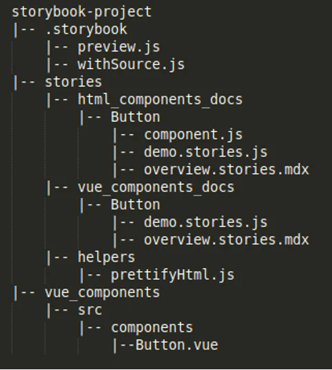
To distinguish the HTML and Vue components documentation, create 2 different parent directories inside stories directory, the final stories directory tree looks like the below image.
The below image is give with example for button component developed in both HTML and Vue
Writing HTML component
Filename -> storybook-project/stories/
html_component_docs/Button/
component.js
1
2
3
| export const Button = ({ label }) => {
return `<button type="button>${label}</button>"`
};
|
Note: Since we installed storybook-vue, HTML components will not render in storybook documentation, So, before writing story for HTML component component, we need a helper to convert HTML component to Vue component for documentation rendering
Install below npm library
1
2
| npm i prettier/standalone
npm i prettier/parser-html
|
Add helper file
Filename -> storybook-project/stories/
helpers/prettifyHtml.js
 1
 2
 3
 4
 5
 6
 7
 8
 9
10
11
12
13
14
15
| import prettier from 'prettier/standalone'
import htmlParser from 'prettier/parser-html'
export const prettifyHtml = str => {
if (!str) return
// https://prettier.io/docs/en/api.html#prettierformatsource-options
return {
template: prettier.format(str, {
plugins: [htmlParser],
parser: 'html',
htmlWhitespaceSensitivity: 'ignore'
})
}
}
|
Writing story for HTML component
Filename -> storybook-project/stories/
html_component_docs/Button/demo.stories.js
 1
 2
 3
 4
 5
 6
 7
 8
 9
10
11
12
13
14
15
16
17
18
19
20
21
22
23
24
25
26
27
| import { Button } from './component';
import { prettifyHtml } from '../../helpers';
export default {
title: 'HTML Components/Button',
component: 'Button',
argTypes: {
label: {
control: 'text',
description: 'Changes the text inside the button.',
table: {
type: {
summary: 'string'
}
}
}
},
};
const Template = ({ ...args }) => {
return prettifyHtml(Button({ ...args }));
};
export const Demo = Template.bind({});
Demo.args = {
label: 'Button Label'
};
|
Other than props defined in demo.stories.js, you can also add additional information like list of event emitters, styles overriding options, slots, design details about Button component in separate story in markdown format named overview.stories.mdx
Filename -> storybook-project/stories/html_component_docs/
Button/overview.stories.mdx
1
2
3
4
5
6
7
| import { Meta } from '@storybook/addon-docs';
<Meta title="HTML Components/Button/Overview"/>
##Button Component
// Add additional details about Button component here
|
Writing Vue component
Filename -> storybook-project/vue_components/src/
components/Button.vue
 1
 2
 3
 4
 5
 6
 7
 8
 9
10
11
12
13
14
15
| <template>
<button type="button">{{label}}</button>
</template>
<script>
export default {
name: 'vue-button',
props: {
label: {
type: String,
default: ''
}
}
}
</script>
|
Writing story for Vue component
Writing story for Vue component doesn't require any helper, since its a direct Vue component which can render in story documentation
Filename -> storybook-project/stories/vue_component_docs/
Button/demo.stories.js
 1
 2
 3
 4
 5
 6
 7
 8
 9
10
11
12
13
14
15
16
17
18
19
20
21
22
23
24
25
26
27
28
29
30
31
32
33
34
35
36
| import Button from "../../../vue_components/src/components/Button.vue"
export default {
title: 'Vue Components/Button',
component: {
Button,
}
};
const Template = (args) => ({
components: {
Button,
},
setup() {
return { args };
},
template: `<Button v-bind="args" />`,
});
export const Demo = Template.bind({});
Demo.argTypes = {
label: {
control: 'text',
description: 'Changes the text inside the button.',
table: {
type: {
summary: 'string'
}
}
}
}
Demo.args = {
label: "Hello Button"
}
|
Other than props defined in demo.stories.js, you can also add additional information like list of event emitters, styles overriding options, slots, design details about Vue Button component in separate story in markdown format named overview.stories.mdx
1
2
3
4
5
6
7
| import { Meta } from '@storybook/addon-docs';
<Meta title="Vue Components/Button/Overview"/>
##Button Component
// Add additional details about Button component here
|
Note: To view source code of both HTML and Vue component, it requires additional script to configure in .storybook directory.
Filename: .storybook/withSource.js
 1
 2
 3
 4
 5
 6
 7
 8
 9
10
11
12
13
14
15
16
17
18
19
20
21
22
23
24
25
26
27
28
29
30
31
32
33
34
35
36
37
38
39
40
41
42
43
44
45
46
47
48
49
50
51
52
53
54
55
56
57
58
59
60
61
62
63
64
65
66
67
68
69
70
71
72
73
74
75
76
77
78
79
80
81
82
83
84
85
86
87
88
89
90
91
92
93
94
95
96
97
| import { addons, makeDecorator } from "@storybook/addons";
import kebabCase from "lodash.kebabcase"
import { h, onMounted } from "vue";
// this value doesn't seem to be exported by addons-docs
export const SNIPPET_RENDERED = `storybook/docs/snippet-rendered`;
function templateSourceCode (
templateSource,
args,
argTypes,
replacing = 'v-bind="args"',
) {
const componentArgs = {}
for (const [k, t] of Object.entries(argTypes)) {
const val = args[k]
if (typeof val !== 'undefined' && t.table && t.table.category === 'props' && val !== t.defaultValue) {
componentArgs[k] = val
}
}
const propToSource = (key, val) => {
const type = typeof val
switch (type) {
case "boolean":
return val ? key : ""
case "string":
return `${key}="${val}"`
default:
return `:${key}="${val}"`
}
}
return templateSource.replace(
replacing,
Object.keys(componentArgs)
.map((key) => " " + propToSource(kebabCase(key), args[key]))
.join(""),
)
}
export const withSource = makeDecorator({
name: "withSource",
wrapper: (storyFn, context) => {
const story = storyFn(context);
// this returns a new component that computes the source code when mounted
// and emits an events that is handled by addons-docs
// this approach is based on the vue (2) implementation
// see https://github.com/storybookjs/storybook/blob/next/addons/docs/src/frameworks/vue/sourceDecorator.ts
return {
components: {
Story: story,
},
setup() {
onMounted(() => {
try {
// get the story source
const src = story.render().type.template;
// generate the source code based on the current args
const code = templateSourceCode(
src,
context.args,
context.argTypes
);
const channel = addons.getChannel();
const emitFormattedTemplate = async () => {
const prettier = await import("prettier/standalone");
const prettierHtml = await import("prettier/parser-html");
// emits an event when the transformation is completed
channel.emit(
SNIPPET_RENDERED,
(context || {}).id,
prettier.format(code, {
plugins: [prettierHtml],
parser: 'html',
htmlWhitespaceSensitivity: "ignore",
})
);
};
setTimeout(emitFormattedTemplate, 0);
} catch (e) {
console.warn("Failed to render code", e);
}
});
return () => h(story);
},
};
},
});
|
Import above script in .storybook/preview.js
1
2
3
4
5
6
7
| import { withSource } from './withSource.js';
...
export const decorators = [
withSource
]
|
Conclusion
In conclusion, maintaining HTML and Vue components within the same Storybook project offers a versatile and efficient approach to component development. By following the guidelines outlined in this comprehensive guide, developers can seamlessly integrate and showcase both types of components, fostering a cohesive and collaborative development environment
If you need help creating Storybook components or custom tags, don't hesitate to reach out! Whether you're looking to build bulletproof UI components or tailor your design system, our team is ready to assist you. Let's work together to bring your ideas to life — contact us today!
Written by:

Chandra Sekar
Senior Frontend Developer
Chandra is an exceptional Vue.js frontend developer who consistently delivers outstanding results. With a keen eye for detail and a deep understanding of Vue.js, Chandra transforms design concepts into seamless and visually captivating user interfaces.
Chandra is an exceptional Vue.js frontend developer who consistently delivers outstanding results. With a keen eye for detail and a deep understanding of Vue.js, Chandra transforms design concepts into seamless and visually captivating user interfaces.