Difficulty Level: Advanced
Prerequisite: You should be familiar with Storybook and using storybook tool for components documentation
Takeaways: This article helps to setup custom tags to storybook components documentation
Why StoryBook?


We use Storybook as a tool for creating and showcasing UI components. It provides a structured environment for developers to build and document the components. In this article you learn about adding custom tags to stories.
Are tags really important to stories(component documentation)?
Let's discuss a real world use case of custom tags to storybook documentation. Before diving deeper, if you're aligned with below 2 questions, then custom tags add more value to your stories.
Why Multiple frontend projects maintained for a product?
Creating a feature-rich web application involves more complexity and maintaining a large codebase. To address this challenge, we delegate user interfaces to different repositories. Instead of having all the frontend code in a single monolithic repository, we compartmentalize the UI components and functionalities into distinct subprojects. These subprojects operate independently, allowing for more focused development efforts and improved codebase manageability.
Owning a component library?
To ensure consistency and reusability across different frontend subprojects, we maintain a master components repository. This repository serves as a centralized hub for reusable components that are shared among various frontend projects.


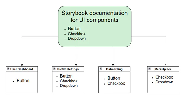
In the above diagram, the master components are consumed in different projects. When there are enhancements to be made to existing components, we should be very careful in understanding the existing usage and impact areas. Apart from documentation on the usage of the component, it's very important to maintain a list of projects where the components are being consumed as part of the documentation.
Add ability to render Custom Tags in existing storybook app
Configure the list of tags inside configs directory storybook-project/stories/configs/yourTagsList.js
| |
Create a new file under .storybook
File name -> storybook-project/.storybook/addTagsToStories.js
Add below code to addTagsToStories.js
| |
Import the above script to .storybook/preview.js as below
| |
Update Component Stories
Let's consider example of Button component documentation in storybook
Create a button component
Filename -> storybook-project/stories/button/component.js
| |
Create a documentation page for button component in storybook
Filename -> storybook-project/stories/button/demo.stories.js
| |
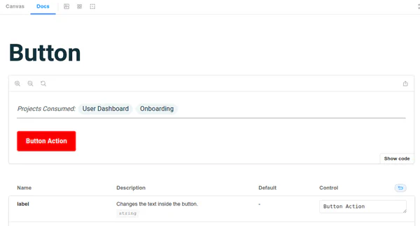
Output


Benefits of Custom Tags
- As a developer and contributor of master components, tags helps to know the list of projects the components are being consumed
- Helps the developer to test the changes made to components on different projects
- Helps the QA to perform the sanity testing on list of projects when a component is being updated
- Helps designer to Scope any new recipe changes to existing components by considering different projects use cases
Encouraging Adoption
- Provide encouragement for developers to adopt custom project tags in their storybook components documentation
- Reiterate the positive impact on development processes and project outcomes.
Create your custom storybook components with Meant4
If you need help creating Storybook components or custom tags, don't hesitate to reach out! Whether you're looking to build bulletproof UI components or tailor your design system, our team is ready to assist you. Let's work together to bring your ideas to life — contact us today!
Written by:

Chandra Sekar
Senior Frontend Developer
Chandra is an exceptional Vue.js frontend developer who consistently delivers outstanding results. With a keen eye for detail and a deep understanding of Vue.js, Chandra transforms design concepts into seamless and visually captivating user interfaces.
Read more like this:

Chandra Sekar
Pinia.js over Vuex for Vue.js state management

Chandra Sekar
Shorthands and Assumptions in Vue.js

Chandra Sekar
The behavior of Two way binding in Vue.js

Chandra Sekar
Vue JS make developer life easier
Got idea?Let’s talk about your project
Schedule a call with us