In the world of modern web design, creating flexible and responsive layouts is a must. Two powerful CSS tools make this possible: Flexbox and Grid. Both offer unique approaches to layout design, but knowing when and how to use them can be a game-changer for your projects. In this blog post, we'll dive into the differences between CSS Flexbox and CSS Grid, explore their strengths and weaknesses, and provide practical examples to help you decide which one to use for your next web layout. Whether you're building complex grid systems or aligning a few elements on a page, understanding these layout systems will give you the control and flexibility you need to create responsive, user-friendly designs.
What is CSS Flexbox?
The CSS Flexible Box Layout Model - flexbox, allows to design flexible and layouts. Places elements in such a way that they behave predictably on different screen sizes and devices. It allows to easily align elements horizontally and vertically, in the right order and size. It makes it easier to create complex layouts and helps ensure consistency across screens.
For Flexbox to work, you must set the element as the parent - container. The Flex container has the property - display: flex. The others elements placed in the container are called as children - Flex items.
- display: flex - defines a flex container
- flex-direction - determines how children are arranged in the "main-axis" line
- flex-wrap - determines whether children will move to a new line or not and in what order
- flex-flow - includes flex-direction and flex-wrap that define the flex container’s main and cross axe
- justify-content - aligns elements along the main axis
- align-items - aligns elements along the cross axis
- align-content - sets the distribution of space between and around content items along cross-axis
- Content alignment - Flexbox makes it simple to align content with properties like justify-content and align-self.
- Simple design layout - Flexbox is perfect for implementing small layout designs with just a few rows or columns.
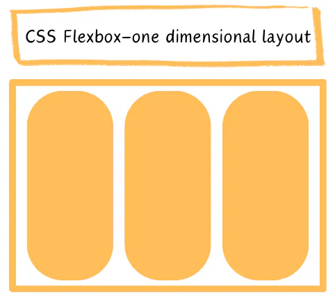
- Creating one-dimensional Layouts - When designing web pages or sections with a singular layout, utilizing flex is recommended for effectively organizing content.
What is CSS Grid?
With CSS grid, you can easily divide your page into sections and position elements within those sections. Grid gives you control over the size of elements and placement. this makes it an ideal solution for creating complex and responsive designs. With grid you can define the size of the grid tracks - rows and columns, and the placement of items within those tracks. You can in an effective way to organize content and create visually appealing and dynamic website layouts.
Similarly to CSS Flexbox in CSS Grid, the parent element becomes the grid container, is the element that contains a set of grid items and defines the overall layout of the grid. The children elements become grid items that can be placed within the grid layout.
- display: grid - defines a flex container
- grid-template-columns - defines the size and number of columns in a grid layout
- grid-template-rows - defines the size and number of rows in a grid layout
- grid-gap - sets the space between rows or columns or both of them within the grid container
- justify-items - aligns the contents of the container along the line axis
- align-items - aligns the contents of the container along the column axis
- justify-content - the property aligns the grid along the line axis
- align-content - the property aligns the grid along the column axis
- Control of whitespace and gap between block elements: It's a thing that flexbox don't have, the grid manages spacing by evenly distributing elements across the row and adjusting their placement according to the space allocated in each column.
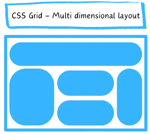
- Complex design layout: If you're working on a composite design project, the two-dimensional layout system is ideal for bringing your it to life. Leveraging grid layout can help us craft intricate and easily manageable web pages that meet our design goals effectively.
- Creating a Responsive Design: Frequently, interfaces are designed to adjust to various screen sizes. In these instances, utilizing a grid layout is highly recommended as it allows for flexibility and easy resizing of elements.
- For a design approach that prioritizes layout: CSS Grid is the perfect choice. It emphasizes precise positioning of content by treating each item as a grid cell aligned on both horizontal and vertical axes. If you seek meticulous control over item placement in your layout, CSS Grid is the ideal solution.
Summary
Flexbox is perfect for one-dimensional layouts like rows or columns, while Grid is better suited for intricate two-dimensional layouts. Flexbox focuses on aligning items within a container, whereas Grid specializes in creating grid-based layouts with detailed control over rows and columns. Generally, both Flexbox and Grid have their strengths and can be used together to create versatile and responsive website layouts.
If you need help with your new Frontend project drop us a line a we will help you make it pixel perfect contact us.
Written by:

Ewelina Zwolenik
Frontend Developer
Ewelina is an amazing frontend developer who's great at working with Vue.js, HTML, CSS, and Tailwind CSS. She has a sharp eye for design and knows how to turn ideas into beautiful, responsive websites and apps that look great on any device.
Read more like this:

Chandra Sekar
Vue JS make developer life easier
Chandra Sekar
How to add custom tags in Storybook
Chandra Sekar
Pinia.js over Vuex for Vue.js state management
Chandra Sekar
Shorthands and Assumptions in Vue.js
Got idea?Let’s talk about your project
Schedule a call with us